Work.
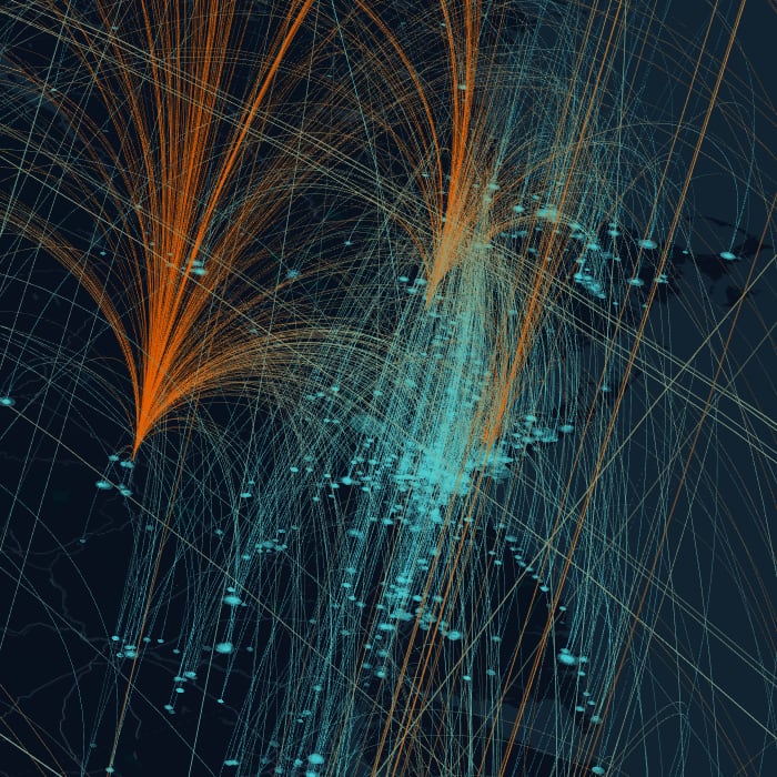
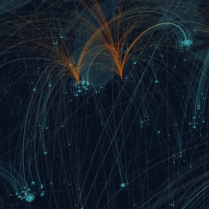
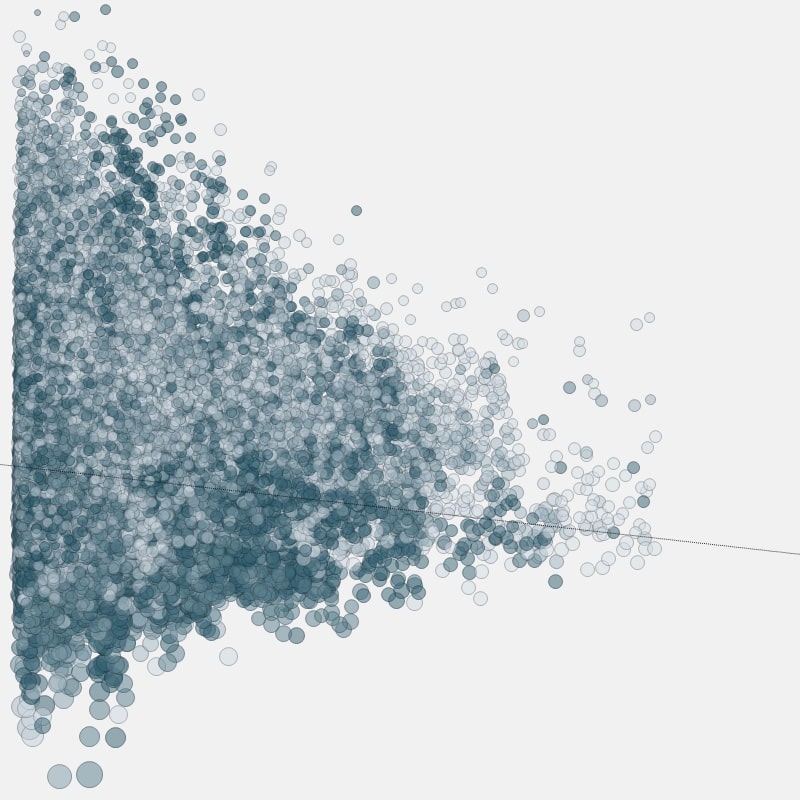
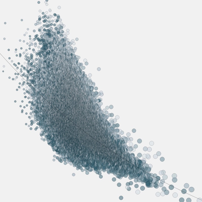
1. Customer mapping (2019; R & kepler.gl)
A series of one-off data visualizations designed for print to explore the proximity of customers to distribution centres. Customers are shown as blue points on the map, connected to distribution centres shown in orange. Individual maps were created for each sales director in North America, showing the location of each of their accounts.
Data assembly, cleaning & analysis in RStudio using Tidyverse; points geocoded using Google Maps API; map visualizations developed using Uber's open source kepler.gl project.
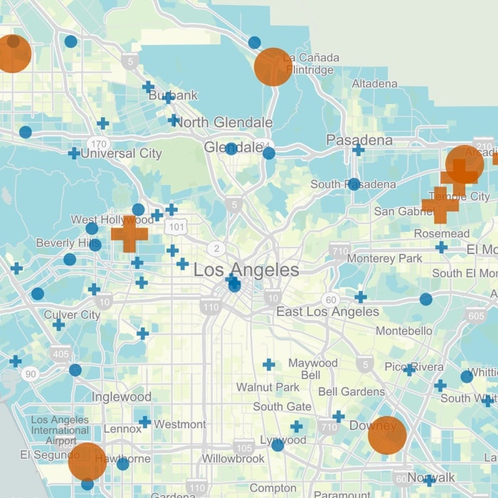
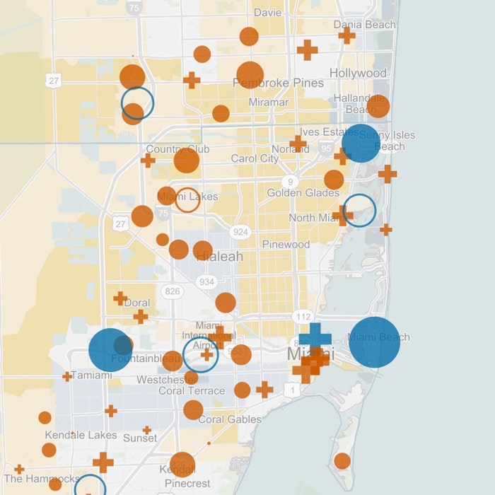
2. Point of sales gap analysis (2018; R & Tableau)
An interactive application developed in Tableau using custom built calculations to display product gaps in physical stores using daily point of sales data provided by a large North American brick & mortar retailer. Stores with no sales of a user selected product during a specified time frame were shown in red, while store attributes were visually encoded in the map marker type.
Automated data ETL written in R and orchestrated through RStudio Server into Hadoop; interactive applications developed and delivered to business users through Tableau Online.
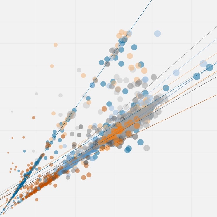
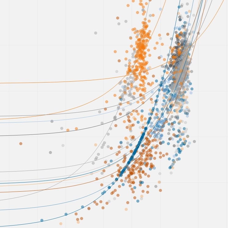
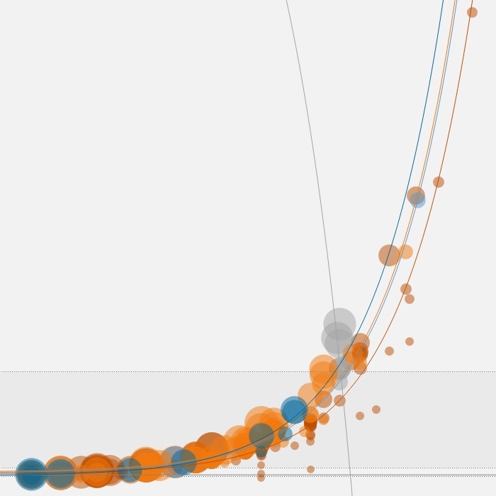
3. Constituent analysis (2017; R & Spotfire)
Sample aggregated views from a series of interactive visualizations developed as part of an analysis to examine the seasonal variation of raw material constituents and to investigate correlations between these constituents at a supplier level over time.
Data assembly, cleaning & analysis in RStudio using Tidyverse; interactive visualizations developed in Tibco Spotfire.
4. Plant effectiveness (2016; R & Tableau)
Sample views from an interactive application developed as part of a larger project to analyse Overall Equipment Effectiveness (OEE = Uptime x Performance x Quality) at one manufacturing site producing a range of materials across multiple shifts.
Data assembly, cleaning & analysis in RStudio using Tidyverse; interactive visualizations developed using Tableau.
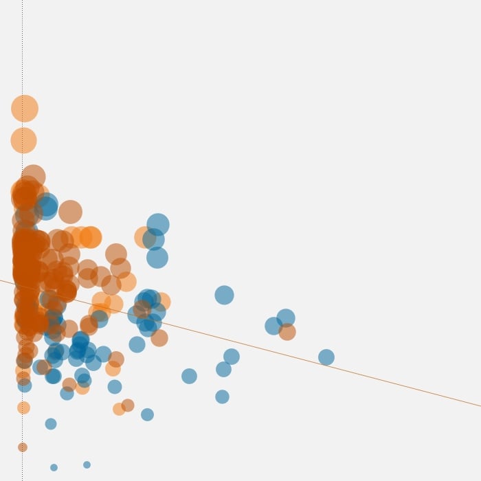
5. Product portfolio analysis (2015; R & Tableau)
Sample views from a series of visualizations designed to analyse the performance of materials across a range of product and geographic groups, with the aim of clustering similar products by geography.
Data assembly, cleaning & analysis in RStudio using Tidyverse; interactive visualizations developed using Tableau.
Other Work.
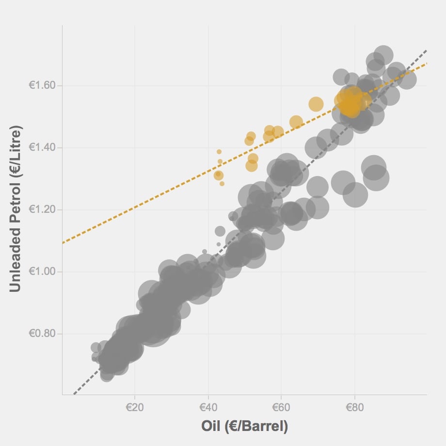
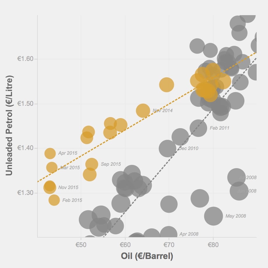
6. Petrol forecourt pricing in Ireland (2015 - personal project; R & Tableau)
Regression model of the 2014/2015 divergence between oil and petrol prices when compared to the historic relationship of these two variables from 1985—2014. While the model is consistently linear, a collapse in oil prices during 2014 was not reflected in lower petrol prices due to a combination of a weak Euro and high levels of fuel taxation in Ireland.
Oil pricing data from Eurostat; petrol forecourt pricing data from theaa.ie; regression model and data visualizations developed in Tableau.
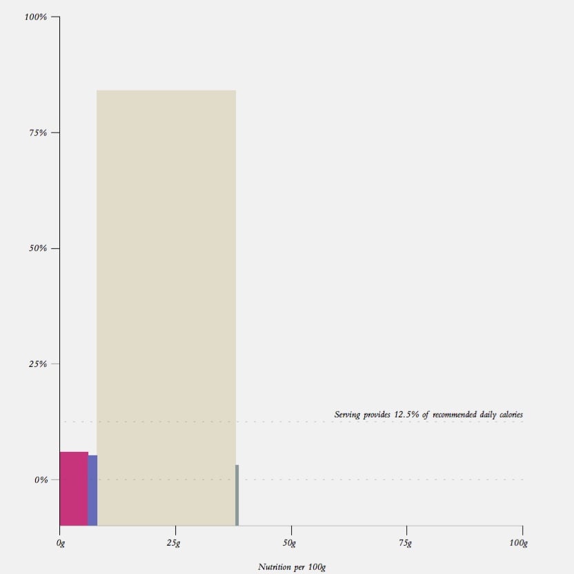
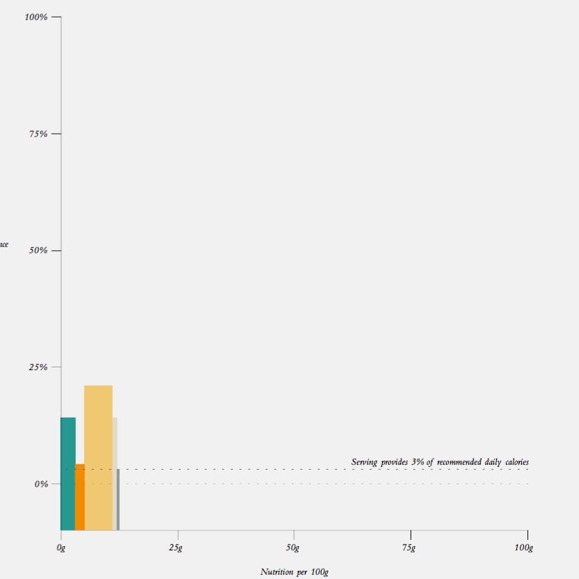
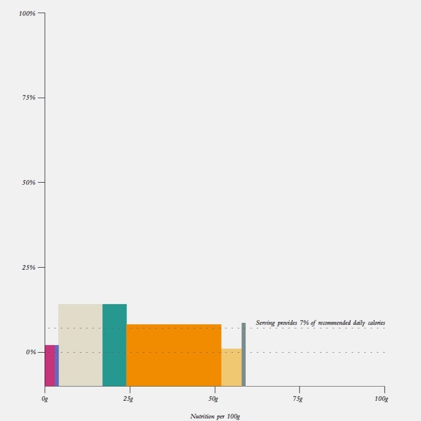
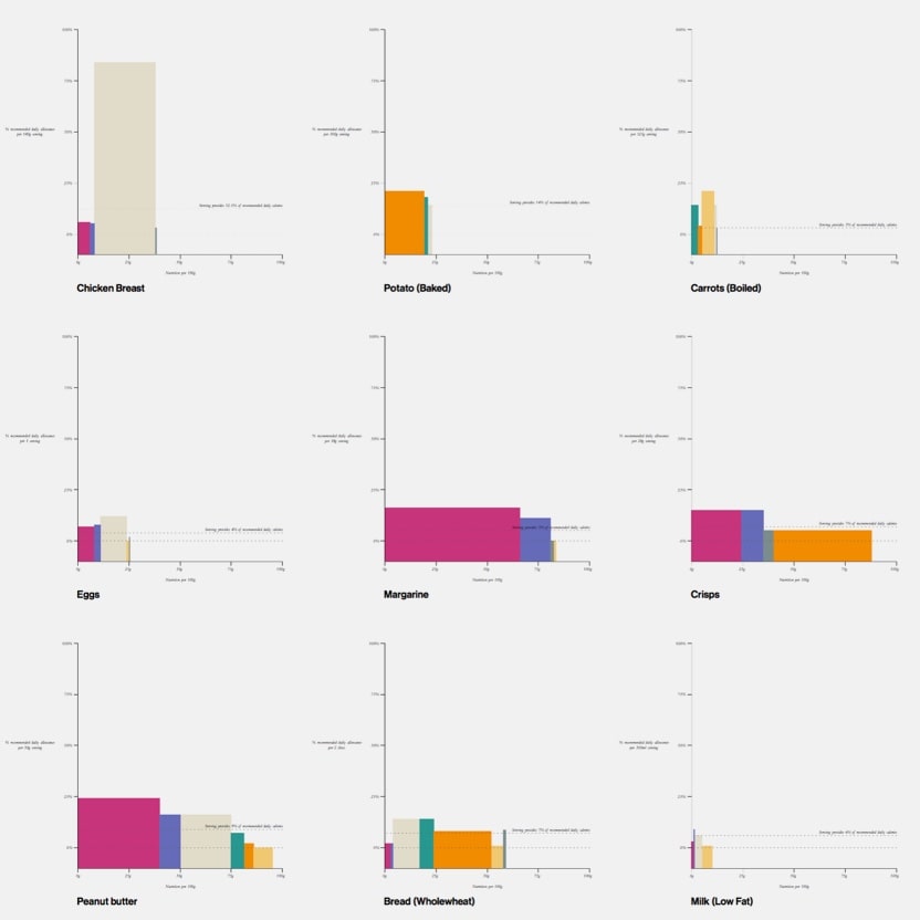
7. Food visualizations (2014 - personal project; VectorWorks)
Sample data visualizations from a series developed to compare the nutritional value of a recommended serving size across a range of fruit, vegetables, meat and snacks. Each visualization represents a food, each coloured bar represents a food component, and the height of a bar represents its proportion of a day's recommended allowance.
Visualizations drawn in Nemetschek VectorWorks.
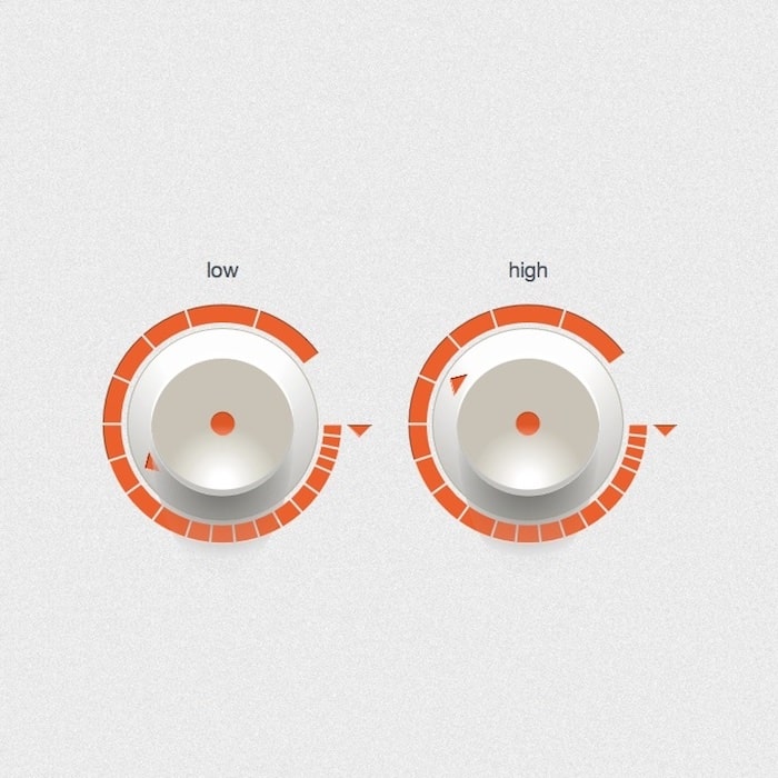
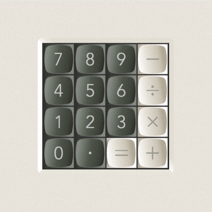
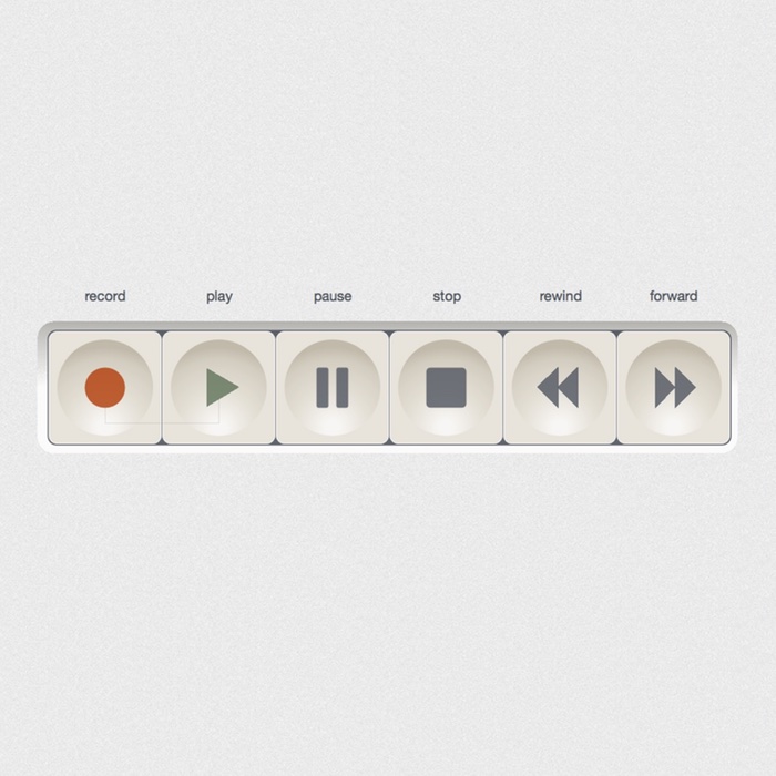
8. Interface elements (2013 - personal project)
A series of icons, buttons, & dials drawn in Nemetschek VectorWorks vector drawing software with grain, texture and shadows added in Adobe Photoshop. A larger collection of these images was featured on the Control Panel blog in 2014.

9. Photography (2012—2019)
Landscape photographs taken on iPhone in Ireland, Europe & North America.